
The international football jerseys act as an emblem of national pride and identity. In football, the kits can inspire teams to victory or at least make them look good in defeat. No matter how many kits fans already have, they are tempted to spend their hard-earned bucks on the latest kits.
But there must have been times where you see a team’s kit and wonder, what were the designers thinking?
With Copa America around the corner, we here at FootTheBall have put together some of the most dreadful kits to ever grace the Copa America competition.
MEXICO 1995 JERSEY
Nope! Not it. This was the second time Mexico were a part of the Copa America as the guest nations have regularly been invited since the 1993 version of the competition.

They decided to wear polo jerseys with a large M in the middle. Of course with the large letter and that colour, it clearly wasn’t a creative idea and was a major fashion failure. Although the kits from Mexico in the last few years have been some of the most beautiful kits ever.
USA 2016 AWAY JERSEY
If a country is hosting the Copa America, they need to make a statement. The USA didn’t do that with this kit. These kits were referred to as the Cop kits and rightfully so. First of all, Nike designed this black jersey for a tournament to be held in the month of June. It would have been a major task to play football in these black kits under the scorching sun.
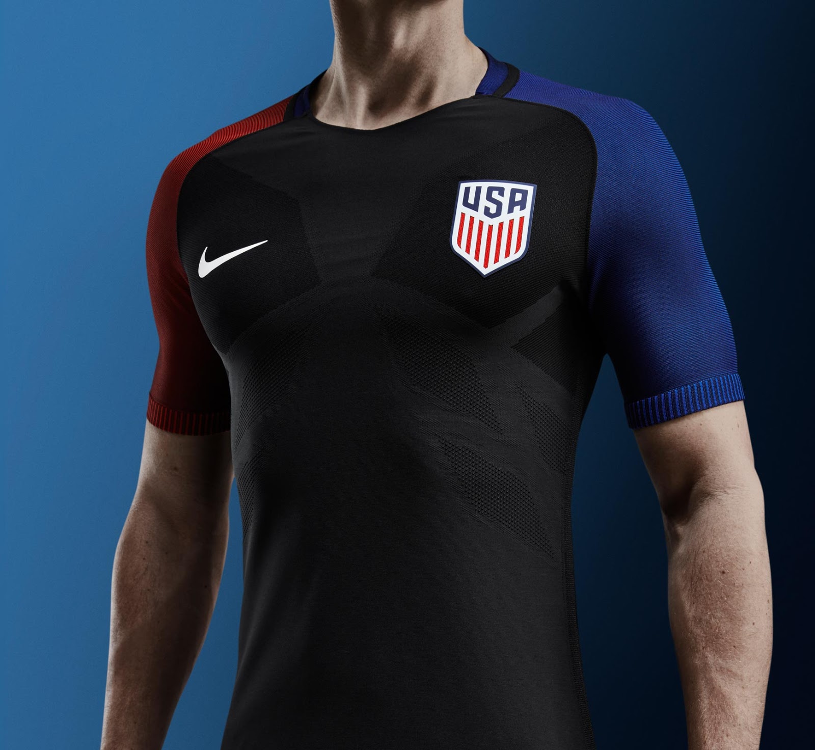
Second, they decided not to stick with the primary American flag colours (Navy, red and white) and hence this black kit with blue and red sleeves wasn’t famous among the USA fans.
Nike believed black kits were a good idea, it clearly wasn’t.
ARGENTINA 2019 HOME JERSEY
We have seen some of the most cracking and classic kits from Argentina, but this kit wasn’t it. These kits weren’t that bad. Adidas decided to thick and fade the Argentina’s traditional light blue strips.
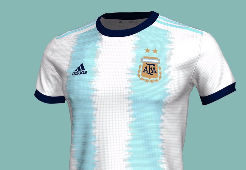
With awkwardly faded two such strips in the front and at the back with dark blue shorts, this kit did not live up to its name. Although the Argentina kits will forever remain popular among the fans of the game.
USA 1995 THIRD JERSEY
We understand that fashion during the 90s was quite different. But this jersey wouldn’t make it in any era of fashion. This was the only second time USA was a part of Copa America, so they probably were worried about playing well way more than looking good. And they surely did that by beating the defending champions Argentina 3-0, winning their group and reaching the semi-finals.
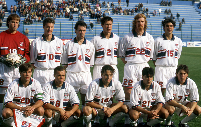
The United States were maybe the biggest surprise in the history of the tournament. But you know what isn’t a surprise? This kit being one of the worst kits in the history of Copa America.
VENEZUELA 2016 HOME JERSEY
Adidas and Venezuela made sure that the players were noticeable from far away when they came up with the idea of these jerseys. A burgundy colour with the fluorescent green trim does not look good and match well. It kind of looks like this jersey was designed by a guy whose shift starts at 3:55 p.m. and ends at 4:00 p.m.

Surely Adidas did not put in any effort to make this kit for the Venezuelan national team and hence they make this list.


