
Premier league is known for its competitiveness, stylish game and atmosphere all around the world but these football kits will surely make to go whaaaaaat!!
10: Sunderland, Goalkeeper Jersey 1994-96
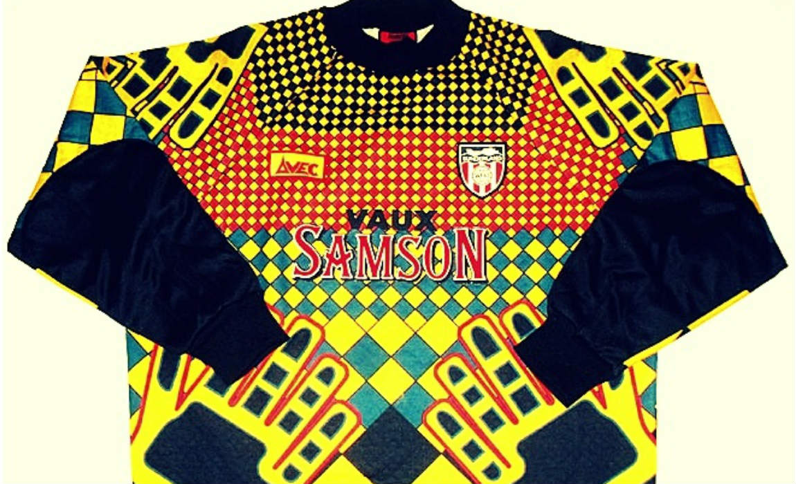 This shirt design resembles to what people used to wear in the 80’s. The horrendous colour combined kit would have been a shame to wear for then Black Cats shot stopper. Maybe the club should have hired decent fashion designers.
09: Chelsea, Away Kit 1994-96
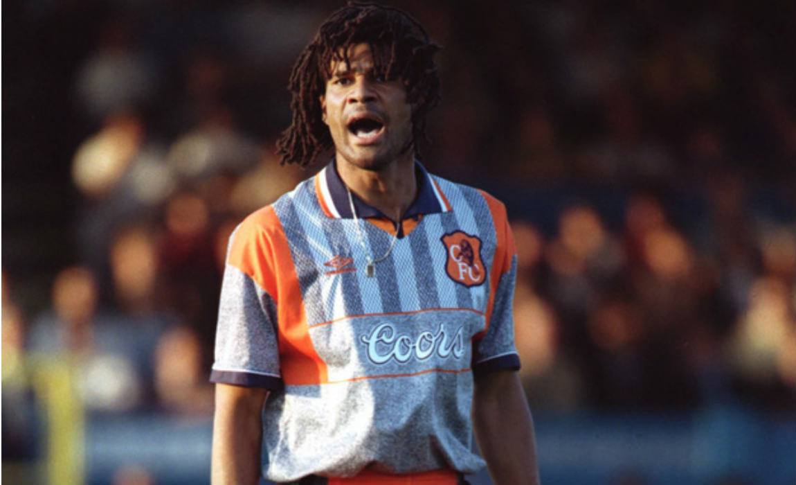 The poorly designed kit reminded of a night suit which you would prefer going to bed rather than stepping on the field with it. It must be a nightmare for the Chelsea players that time and we feel sorry for them.
08: Liverpool, Goalkeeper Away Jersey 1995-97
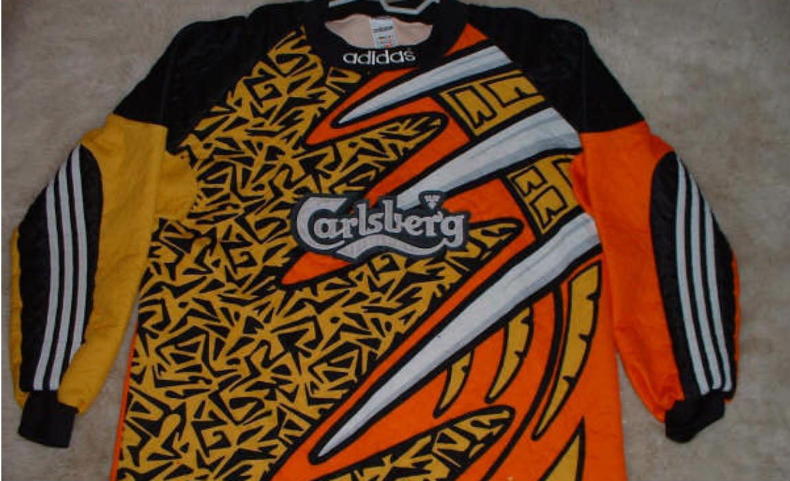 Premier league kits during the 90’s were badly designed as this Adidas jersey would even make the best goalkeeper in the world look like an idiot. Well, I would never wear this one because it would make me look like a psycho who escaped a lunatic asylum.
07: Stoke City, Away Jersey 1992-93
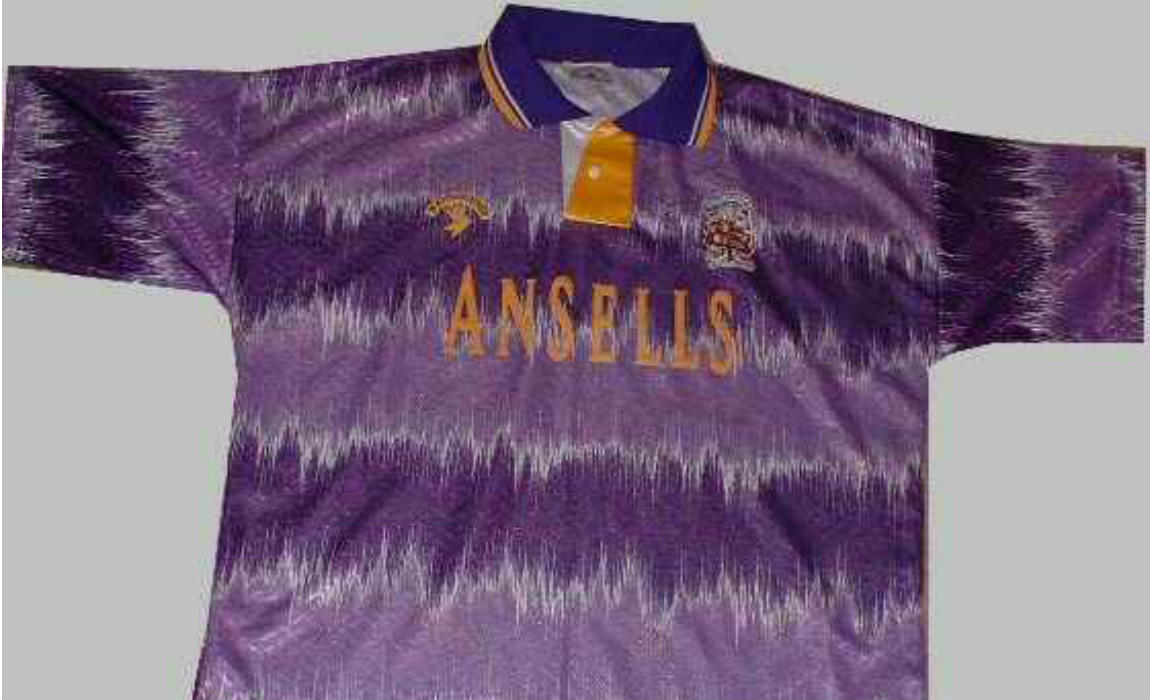 The all purple jersey with horizontal white zigzag lines was one to forget for the Potters. Fortunately the fans did not witness their players wearing such horrible kit at their home stadium in the 1990’s which was certainly not an era for fashion design.
06: Southampton, Third Kit 1991
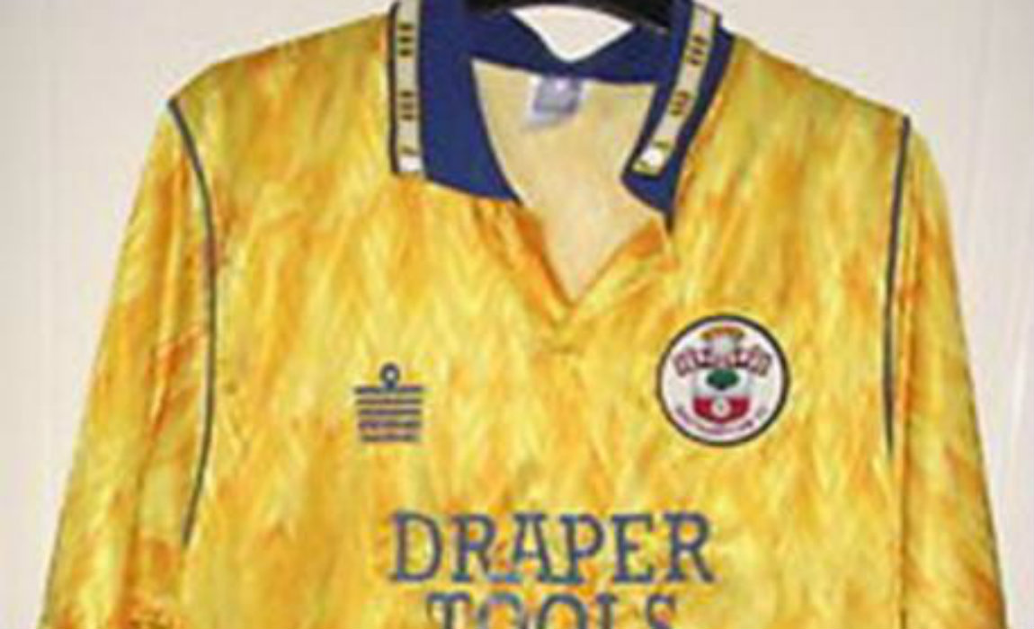 The eye hurting bright yellow jersey made the matters worse with all white shorts and socks combination. It was surely the worst kit in their club history and maybe even the Premier league.
05: Bournemouth, Away Jersey 1993-94
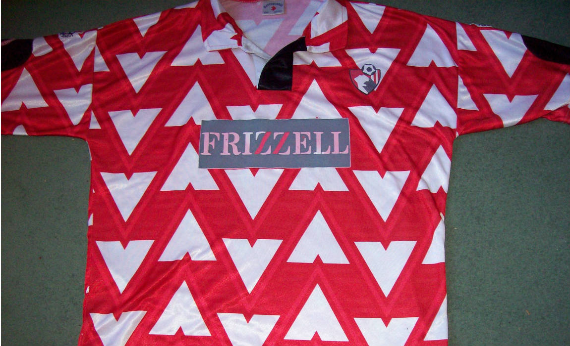 The Cherries wore the kit in their away matches for a single season. The poor co-ordination of colours and design made it look like it was crafted by a drug addict who got out of a rehab.
04: Burnley, Away Jersey 1993-94
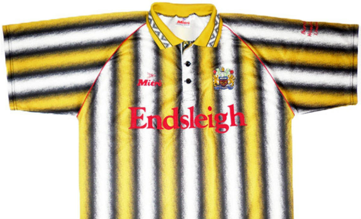 This jersey was created to celebrate a special occasion in Burnley’s history who reached the playoffs at the Wembley stadium. Some may call it a classic or vintage jersey but Burnley deserved a lot better to cherish their major achievement.
03: Watford, Home Jersey 2015-16
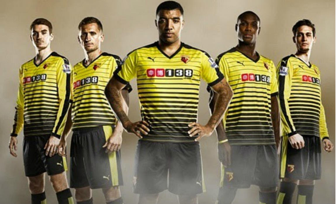 The Hornets donned this jersey when they earned their Premier league promotion. Canadian based company Dryworld designed the kit which earned comparision to that of German side Borussia Dortmund.
02: Arsenal, Away Jersey 1991-93
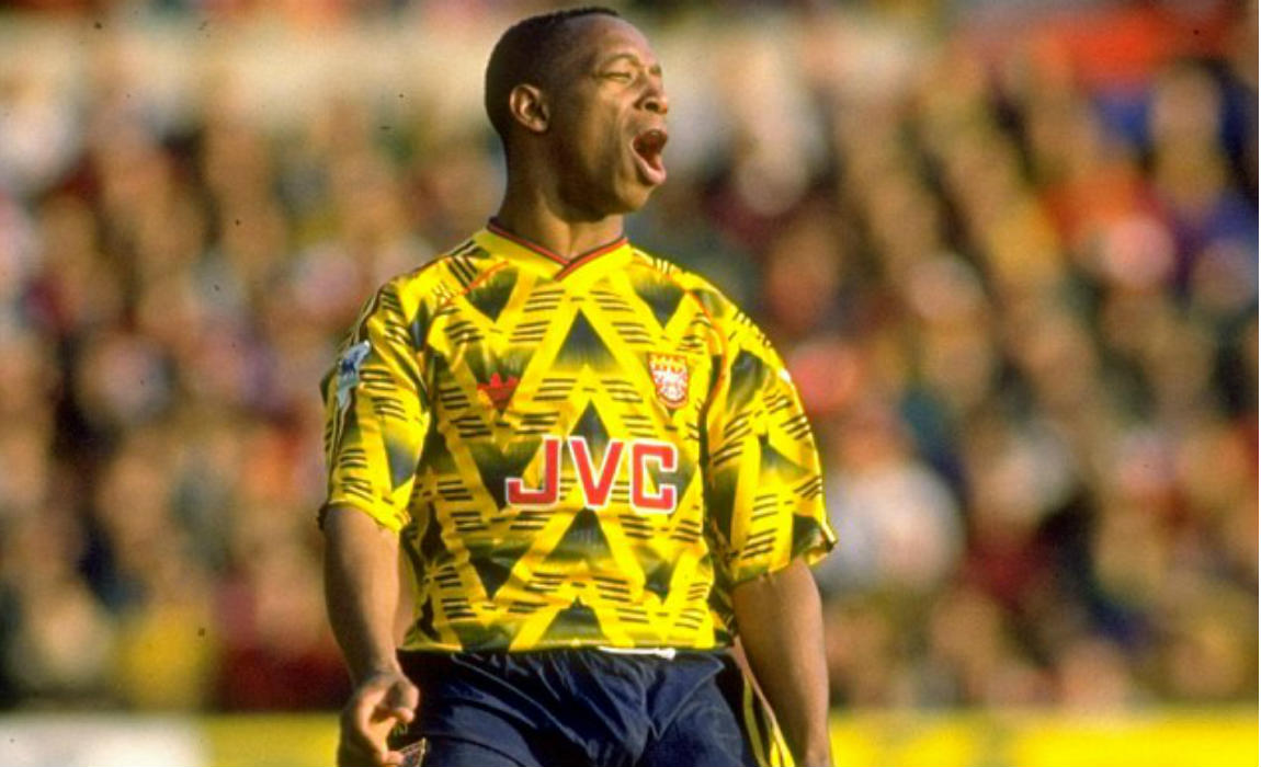 One more from the 90’s collection, Arsenal’s away kit was bright yellow with black designs but the look was not even average thus failing to pass the test.
01: Crystal Palace, Goalkeeper Kit 1994-95
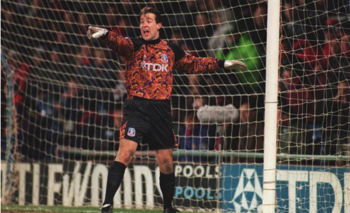 This Eagles kit is a good example of a bad shirt design. Coming from the 90’s, it was a LSD-esque jersey with yellow, orange, purple and black colours combined together. You need a magnifying glass to discern the colours.


